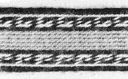
When planning a band, your choice of yarn can be the difference between a fun weave and a deeply frustrating one. Try to choose a smooth, strong, tightly- twisted yarn. A fluffy yarn will be sticky and difficult to work with and a loosely twisted yarn is likely to fall apart due to friction from the movement of the tablets. If the yarn has any mohair content, run for the hills!
Some of my early handspun; completely unsuitable for tablet weaving
Next, you should think about the final use of the band. A belt needs to be strong and hard wearing, while a trim for a garment can't be too bulky and needs to be able to move with the garment.
If you're weaving a band for reenactment purposes, make sure you use an appropriate yarn. Cotton, for example, is unsuitable for Viking reenactment, as cotton wasn't yet known in that time or place.
Trim also needs to be able to be washed with the garment (unless you unpick it before washing, then sew it back on when the garment is dry). The last thing you want is for your gorgeous wool trim to felt after you've spent so much time weaving it. Even if you don't intend to launder a band, it may still get wet in the rain, so make sure that it won't leak colour when wet. You can test it by leaving some lengths of the yarn in water overnight. If the water changes colour, you'll need to wash the yarn to remove excess dye before weaving with it.
You also need to consider if your colours will work well together. Borrowing a little from heraldry, the Rule of Tincture is a helpful framework. A metal (gold/ yellow and silver/ white) should not be placed next to a metal and a colour (red, green, blue, black, purple etc) should not be placed next to a colour. This means that the pattern will be easy to distinguish from a distance (even if you aren't viewing it from across a battlefield).
If do you plan to place a colour next to a colour, make sure that there is enough contrast between them. Try taking a picture of the yarns next to each other, then applying a greyscale/grayscale filter. If you can't tell which is which, you may want to reconsider your colour choices or place a more contrasting colour between them.
A band I wove about 12 years ago with a Greek keys pattern. The Greek keys in the middle blue/ green section (above) are difficult to make out because the colours don't have enough contrast and look like the same colour when put through a greyscale filter (below)


No comments:
Post a Comment